Marathon Poster Ideas
For engaging marathon posters, use vibrant colors, motivational quotes, and dynamic imagery to catch attention. Incorporate race details prominently.
Marathon events are exciting showcases of endurance and determination, where runners push their limits to achieve remarkable feats. A well-designed poster can not only promote the event but also inspire participants to sign up and train harder. By using eye-catching visuals, compelling slogans, and essential information like date, location, and registration details, the poster can effectively communicate the energy and spirit of the marathon.
The design should evoke a sense of excitement and motivation, encouraging viewers to join in the challenge. We will explore creative ideas to design captivating marathon posters that will leave a lasting impression and drive participation.

Credit: www.pinterest.com
1. Typography Choices
Choosing the right typography for your marathon poster is essential to effectively communicate your message and attract attention. Different fonts can convey different emotions and styles, making it important to carefully consider your choices. Here are some typography options that you can use for your marathon poster:
1.1 Sans-serif Fonts
Sans-serif fonts are clean, modern, and easy to read. They are often used for a sleek and professional look, making them suitable for conveying important information such as event details and sponsor logos. Examples of popular sans-serif fonts include Arial, Helvetica, and Verdana.
1.2 Handwritten Fonts
Handwritten fonts add a personal touch to your poster and can evoke a sense of warmth and authenticity. They are great for conveying a more casual and friendly tone, making them ideal for event slogans, inspirational quotes, and personalized messages. Some popular handwritten fonts include Brush Script, Pacifico, and Comic Sans.
1.3 Bold Fonts
Bold fonts are attention-grabbing and impactful. They can be used to emphasize key information such as event dates, location, and important calls to action. Bold fonts are great for creating a sense of urgency and drawing immediate attention to the most crucial elements of your poster. Examples of bold fonts include Impact, Futura, and Bebas Neue.
2. Color Palette Selection
Choosing the right colors for your marathon poster is crucial to attract attention and convey the message effectively. A well-thought-out color palette can make your poster stand out and leave a lasting impression on viewers.
2.1 Vibrant Colors
Vibrant colors are energetic and eye-catching, perfect for creating a dynamic and lively poster. Colors like bright red, electric blue, and vibrant yellow can evoke a sense of excitement and energy, ideal for a marathon event poster.
2.2 Pastel Colors
Pastel colors are soft and soothing, giving a gentle and calming effect. Soft pink, light blue, and pale green can add a sense of elegance and sophistication to your poster design, appealing to a more subtle audience.
2.3 Monochromatic Colors
Monochromatic colors focus on a single color in different shades and tones. Using varying shades of a single color, such as different hues of blue or grey, can create a harmonious and sleek design for your marathon poster, ensuring a cohesive and visually appealing look.
3. Incorporating Motivational Quotes
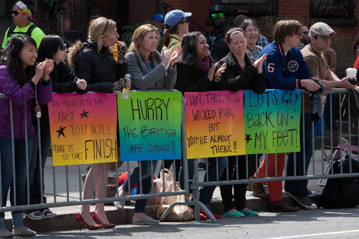
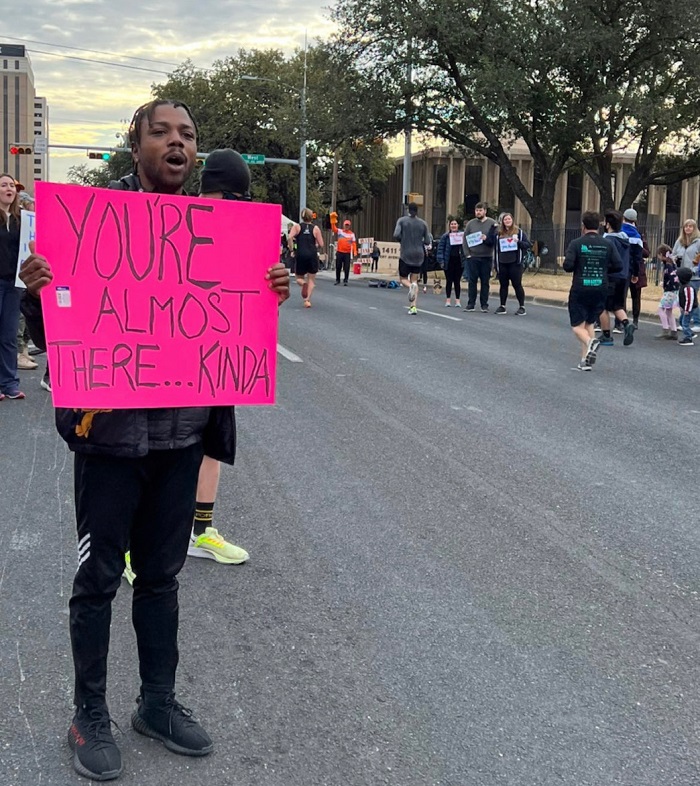
Incorporating Motivational Quotes in your marathon poster can provide runners with the extra boost of inspiration and encouragement they need to push through the entire race.
3.1 Inspirational Sayings
Inspirational sayings can ignite determination in runners who see them along the marathon course.
3.2 Encouraging Words
Using encouraging words like “You’ve Got This!” or “One Step Closer to Your Goal” can motivate runners to keep moving forward.
3.3 Mantras
Mantras such as “I Am Strong” or “Mind Over Miles” can empower runners to push their limits and finish strong.
4. Highlighting The Race Details
When creating a marathon poster, it’s crucial to highlight the race details prominently. This information helps participants and spectators understand the key logistics of the event, ensuring everything runs smoothly on the big day. Here’s how you can effectively showcase the race details on your marathon poster:
Date And Time
To ensure that everyone is aware of the event schedule, prominently display the date and time of the marathon. Bold highlighting these details will attract attention and help people plan their participation accordingly.
Location
Include the precise location of the marathon, including the starting point and any relevant landmarks. Bold highlighting the location details ensures that participants and spectators can easily find their way to the event.
Distance
Clearly stating the distance of the marathon, whether it’s a full marathon, half-marathon, or any other variation, is essential for participants to prepare adequately. Bold highlighting the distance helps runners make informed decisions about their participation.
5. Including Visual Elements
Visual elements play a crucial role in creating appealing marathon posters that catch the attention of viewers. Incorporating images, graphic symbols, and marathon-related icons can enhance the overall design and make your poster more engaging. In this section, we will explore different ways you can include visual elements in your marathon poster.
5.1 Images Of Runners
To capture the essence of a marathon, consider including images of runners in your poster. These images not only depict the physicality and determination involved in running, but they also inspire potential participants to take part in the event. Select high-quality images that showcase the energy, excitement, and camaraderie of marathon runners.
5.2 Graphic Symbols
Graphic symbols can be powerful visual tools in marathon posters. These symbols can represent various aspects of the marathon, such as speed, endurance, and achievement. Incorporating symbols like running shoes, stopwatch, or a finish line can convey the message effectively. Simple and recognizable symbols can make a strong impact on viewers and help them associate the poster with the marathon event.
5.3 Marathon-related Icons
Marathon-related icons are another way to add visual interest to your poster. These icons can include images of medals, trophies, or ribbons, representing the rewards and recognition associated with completing a marathon. Additionally, you can include icons that symbolize the location or theme of the marathon, giving the poster a unique and personalized touch.
When incorporating visual elements in your marathon poster, remember to maintain a consistent color scheme, typography, and overall design. This ensures that your poster looks professional and cohesive. Whether you choose images of runners, graphic symbols, or marathon-related icons, make sure they align with the event’s theme and purpose.
Credit: www.runtothefinish.com
Credit: www.runtothefinish.com
Frequently Asked Questions Of Marathon Poster Ideas
Can You Provide Some Creative Marathon Poster Ideas?
Marathon posters can showcase race routes, vibrant colors, inspirational quotes, and participants in action to motivate and engage runners.
What Are Some Key Elements To Include In A Marathon Poster Design?
A marathon poster design should include the race name, date, location, sponsor logos, visually appealing graphics, and a call-to-action to inspire participation.
How Can I Make My Marathon Poster Stand Out From The Crowd?
To make your marathon poster stand out, use eye-catching colors, unique typography, highlight key details, incorporate local landmarks, and focus on showcasing the energy and excitement of the event.
Conclusion
In designing marathon posters, creativity is key. Your poster should convey the event’s spirit, date, and location clearly. A captivating design and striking visuals will attract attention. With the right mix of information and aesthetics, your poster can effectively promote the marathon.
Happy designing!
